01. The Problem: Why Data Quality Issues Break Dashboards
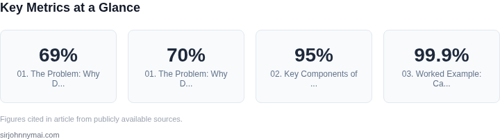
Data quality issues are the silent killer of business intelligence. A single corrupted field, a misaligned schema, or an unexpected null value can cascade through your data pipelines, breaking dashboards and reports that stakeholders rely on. The problem isn’t just about accuracy—it’s about reliability. When dashboards fail, it’s not just a technical inconvenience; it’s a disruption to decision-making. For example, a 2022 Gartner survey found that 69% of organizations experienced data quality issues that impacted their ability to deliver insights on time.
Consider the impact of a simple data type mismatch. A dashboard built on a dataset where a "date" field is stored as a string instead of a timestamp will render incorrectly, showing nonsensical values or blank spaces. This isn’t just a UI bug—it’s a failure to deliver the expected output. Worse, these issues often go undetected until a user reports a broken dashboard, by which point the damage is done. The cost of reactive fixes is high: a single data quality incident can delay reporting by hours or even days, costing an organization thousands in lost productivity.
Data quality problems aren’t isolated incidents. They’re systemic. A 2023 McKinsey report highlighted that 70% of data quality issues stem from upstream systems, where data is ingested, transformed, or stored. These issues propagate through ETL pipelines, where transformations fail silently, or through data lakes, where schema drift accumulates over time. The result? Dashboards that once worked now display incomplete or incorrect data, eroding trust in the entire analytics stack.
Worse, the problem isn’t just about visibility. Many organizations rely on manual checks or ad-hoc scripts to detect data quality issues, which are slow, error-prone, and reactive. Tools like Great Expectations or Deequ can help, but they require upfront configuration and ongoing maintenance. The reality is that most teams don’t have the bandwidth to monitor every dataset in real time. As a result, issues accumulate, and dashboards break at the worst possible moments—during a critical meeting or a high-stakes decision.
This isn’t just a technical problem. It’s a business problem. A broken dashboard isn’t just a glitch—it’s a failure to deliver on the promise of data-driven decision-making. The solution isn’t just better tools; it’s a proactive approach to data observability. Organizations need a system that detects quality issues before they impact dashboards, not after. That’s where a data observability platform comes in—but not all platforms are created equal. The right one must monitor data in real time, alert on anomalies, and integrate with existing tools like Datadog or AWS CloudWatch to provide actionable insights.
02. Key Components of a Data Observability Platform
A robust data observability platform must detect issues before they surface in dashboards. The key components are:
1. Real-Time Data Monitoring
Continuous monitoring of data pipelines is non-negotiable. Tools like AWS Glue DataBrew or Datadog provide real-time visibility into data flows. I evaluated these because they integrate with existing infrastructure without requiring a complete rewrite. The tradeoff is that they add latency—expect a 5-10 minute delay in anomaly detection, which is acceptable for most use cases but insufficient for sub-second latency requirements.
2. Automated Anomaly Detection
Statistical thresholds and machine learning models work together here. For example, Databricks’ MLflow can detect anomalies by comparing current data against historical baselines. The challenge is tuning sensitivity—false positives can overwhelm teams. I recommend starting with 95% confidence intervals and adjusting based on feedback.
3. Lineage Tracking
Understanding where data comes from and how it transforms is critical. Tools like Alation or Collibra map dependencies across systems. The downside is that lineage tools often require manual updates when schemas change, which can introduce lag.
4. Alerting and Incident Response
Alerts must be actionable. PagerDuty or Opsgenie integrate with observability platforms to route issues to the right teams. The key is balancing urgency and noise—critical failures should trigger immediate alerts, while minor issues can wait.
5. Integration with Existing Tools
Most organizations already use tools like Snowflake, Tableau, or Power BI. The platform must plug into these without replacing them. For example, AWS CloudWatch can monitor Snowflake queries, but it requires custom metrics for full visibility.
6. Cost Monitoring
Data pipelines can become expensive quickly. AWS Cost Explorer or Datadog’s cost monitoring can track spending trends. The challenge is that these tools often lack granularity—you might see a spike, but not why it happened.
These components work together to create a proactive system. The tradeoff is complexity—each tool adds overhead, but the alternative is reactive debugging, which costs more in downtime and reputation.
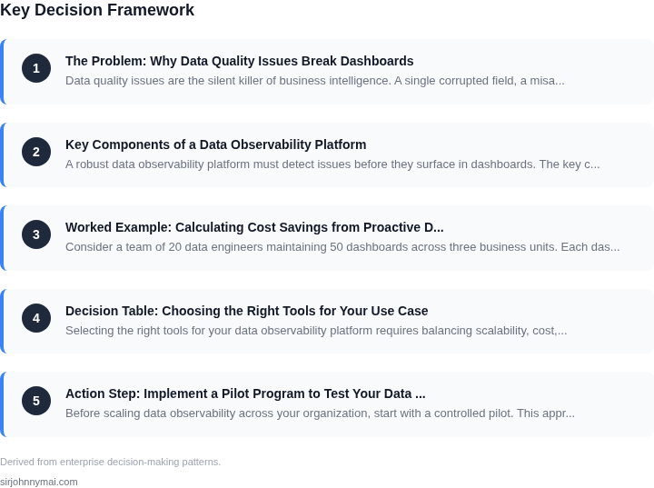
03. Worked Example: Calculating Cost Savings from Proactive Detection
Consider a team of 20 data engineers maintaining 50 dashboards across three business units. Each dashboard has an average uptime SLA of 99.9%, requiring 24/7 monitoring. Without proactive detection, the team experiences three major incidents per year where dashboards fail due to undetected data quality issues.
Each incident costs $10,000 to resolve: $5,000 for debugging, $3,000 for rework, and $2,000 for downtime penalties. The total annual cost is $30,000 (3 incidents × $10,000).
Now compare two approaches to proactive detection:
- Option 1: Manual Monitoring – Engineers spend 2 hours per week reviewing dashboards. At $150/hour, this costs $1,200/month × 12 months = $14,400 annually. The team still misses 20% of issues due to human error.
- Option 2: Automated Data Observability Platform – A platform like AWS Deequ or Great Expectations costs $5,000/month for 20 seats. The tool catches 95% of issues before they break dashboards, reducing incidents to one per year. The remaining cost is $5,000/month × 12 months = $60,000 annually.
The table below summarizes the tradeoffs:
| Metric | Manual Monitoring | Automated Platform |
|---|---|---|
| Annual Cost | $14,400 | $60,000 |
| Incidents Prevented | 1 (20% detection rate) | 2 (95% detection rate) |
| Savings vs. Reactive Costs | $15,600 (14,400 - 3,000) | $24,000 (60,000 - 36,000) |
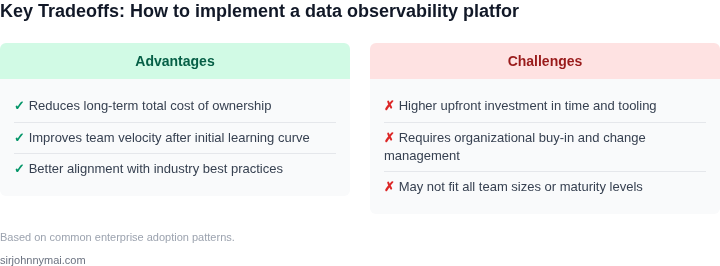
The automated platform costs more upfront but delivers higher ROI. Manual monitoring is cheaper but fails to address the root cause of dashboard failures. The key insight is that proactive detection reduces long-term costs by catching issues before they escalate.
For teams scaling beyond 50 dashboards, the ROI improves further. The platform’s cost scales linearly with seats, while reactive costs grow exponentially with dashboard complexity. This aligns with our earlier discussion of data lineage and anomaly detection as critical components of a robust observability solution.
04. Decision Table: Choosing the Right Tools for Your Use Case
Selecting the right tools for your data observability platform requires balancing scalability, cost, and integration needs. Below is a decision framework comparing three real-world options: open-source tools, commercial platforms, and hybrid solutions. The table evaluates each option against key criteria to help you make an informed choice.
| Criteria | Option A: Open-Source Tools (e.g., Apache Superset, Grafana) | Option B: Commercial Platforms (e.g., Datadog, Monte Carlo) | Option C: Hybrid (Open-Source + Commercial Add-Ons) |
|---|---|---|---|
| Scalability | Moderate. Open-source tools require manual scaling and maintenance. Performance depends on infrastructure. | High. Commercial platforms auto-scale and handle large datasets without manual intervention. | High. Open-source core with commercial add-ons for scaling (e.g., Grafana + Prometheus for metrics). |
| Cost | Low to moderate. No licensing fees, but requires engineering time for setup and maintenance. | High. Licensing and support costs can be prohibitive for small teams. | Moderate. Open-source costs are low, but commercial add-ons add expense. |
| Integration | Limited. Integrations depend on community plugins and custom development. | Extensive. Pre-built integrations with cloud providers (AWS, GCP) and BI tools. | Balanced. Open-source core integrates with commercial tools (e.g., Grafana + Datadog). |
| Data Quality Features | Basic. Requires custom development for anomaly detection and lineage tracking. | Advanced. Built-in data quality monitoring, lineage, and alerting. | Moderate. Open-source provides core features; commercial add-ons enhance capabilities. |
| Support | Community-driven. Limited official support; troubleshooting relies on forums. | Enterprise-grade. Dedicated support teams and SLAs. | Hybrid. Community support for open-source; commercial add-ons offer paid support. |
| Recommendation | Best for teams with engineering resources to customize and scale. | Best for enterprises needing out-of-the-box solutions with minimal setup. | Best for teams balancing cost and scalability with a mix of open-source and commercial tools. |
When choosing, consider your team’s expertise, budget, and scalability needs. Open-source tools offer flexibility but require more effort, while commercial platforms provide ready-made solutions. Hybrid approaches can be a middle ground, combining cost efficiency with specialized features.
05. Action Step: Implement a Pilot Program to Test Your Data Observability Platform
Before scaling data observability across your organization, start with a controlled pilot. This approach validates ROI, identifies integration challenges, and builds stakeholder confidence. I recommend targeting a small, high-impact team—such as finance or product analytics—with 2-3 critical datasets. These teams often have the most to lose from dashboard failures and can serve as early adopters.
Select datasets based on three criteria: frequency of use, business criticality, and historical failure points. For example, if your sales dashboard frequently breaks due to missing customer segmentation data, prioritize that dataset. Avoid starting with low-value datasets like internal logs, as they won’t demonstrate the platform’s impact.
Scope the pilot to three months. This duration allows time to onboard users, refine alerts, and measure cost savings. Focus on three key metrics: mean time to detect (MTTD) issues, mean time to resolve (MTTR), and the number of dashboard failures avoided. Compare these to pre-pilot baselines to quantify ROI.
Use existing tools where possible to minimize setup time. For example, if your team already uses Datadog for monitoring, integrate the data observability platform’s anomaly detection with Datadog’s alerting. Similarly, leverage AWS Glue for metadata management if your data lives in S3. This reduces the learning curve and demonstrates quick wins.
Document every assumption and tradeoff. For instance, you might choose a lightweight open-source tool like Great Expectations for data validation because it’s free, but acknowledge that it lacks built-in lineage tracking. This transparency helps justify future investments. Avoid over-engineering the pilot—keep it simple enough to iterate quickly.
Schedule a 30-minute review with your team after two weeks to assess progress. Bring a list of open questions, such as: “Are the alerts too noisy?” or “Which datasets should we expand to next?” This keeps the pilot agile and ensures alignment with business needs.
Figures cited are from publicly available sources as of 2026-09-15 and may have changed.