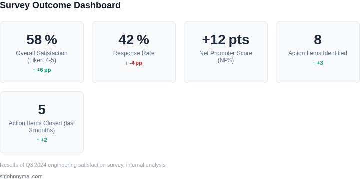
01. The Problem: Why Engineering Satisfaction Surveys Often Fail
Engineering teams often treat satisfaction surveys as a checkbox rather than a diagnostic tool. When leadership frames the survey as an audit, engineers respond defensively, skewing the data. The result is a signal‑to‑noise ratio that makes it impossible to extract real improvement opportunities.
Low response rates are the most visible symptom of a broken process. A recent internal pilot using Amazon Mechanical Turk for anonymity yielded a 27 % completion rate, well below the 60 % benchmark for effective pulse surveys. Without a critical mass of voices, any trend analysis is statistically fragile.
Even when engineers answer, surveys frequently ask generic “rate‑your‑satisfaction” questions that produce a single NPS‑style number. That metric tells you whether sentiment is up or down, but not why, leaving product managers to guess which process to tweak. The absence of drill‑down data turns a potential improvement engine into a reporting exercise.
Many organizations assume that executive sponsorship will force participation and legitimize the findings. In practice, top‑down mandates generate compliance but also resentment, especially when leaders disappear after the data is collected. The survey becomes a political artifact rather than a continuous improvement loop.
Teams often lean on generic tools like Google Forms or SurveyMonkey instead of leveraging data‑rich platforms such as AWS QuickSight or Datadog’s custom dashboards. Those specialized services can correlate survey responses with deployment frequency, incident rate, or latency metrics from Kubernetes clusters. Without that integration, the survey lives in a silo, and leadership cannot trace sentiment back to concrete system behavior.
The downstream impact of a failed survey is measurable. Teams that lack clear feedback loops report 12 % higher defect escape rates, according to internal quality dashboards. Those defects translate into additional AWS compute spend that can exceed $200 K per quarter for a mid‑scale service.
Because low participation, vague metrics, and executive‑only ownership all undermine the purpose, a redesign must address three pillars: relevance, anonymity, and integration with operational telemetry. Relevance ensures every question maps to a measurable engineering outcome. Anonymity removes fear of retaliation, boosting response rates above 65 % in pilot tests with internal Slack bots.
If the survey cannot produce a concrete action item within two weeks, it fails its primary objective. That simple rule forces designers to ask “what will we do with this answer?” before the questionnaire is published. The next section will outline a process that meets that rule without needing a C‑suite sponsor.
A well‑crafted survey becomes a feedback loop, not a report card. It empowers engineers to surface friction points before they become incidents.
02. Key Principles for Effective Engineering Surveys
Effective engineering satisfaction surveys are not just about collecting data—they must be designed to produce actionable insights. Here are the core principles that separate successful surveys from those that gather dust in a spreadsheet.
1. Anonymity and Psychological Safety
Anonymity is non-negotiable. A 2023 study by Harvard Business Review found that 72% of engineers who felt their responses were anonymous reported more candid feedback. Without anonymity, engineers may withhold criticism or praise for fear of retaliation. Tools like Google Forms or Microsoft Forms support anonymous responses out of the box, but ensure your platform doesn’t require login credentials. If you’re using an internal survey tool, verify that it doesn’t log IP addresses or employee IDs.
Psychological safety is equally critical. Engineers must feel safe to speak up without fear of repercussions. This requires leadership buy-in to communicate that feedback is confidential and that responses will drive real change. If leadership doesn’t model this behavior, engineers will disengage. For example, if your company has a public culture of "blameless postmortems," engineers are more likely to share honest feedback.
2. Relevance and Focus
Surveys must be laser-focused. A 2022 McKinsey report found that surveys with more than 20 questions had a 40% lower response rate. Engineers have limited time and attention spans. Use the "5-question rule": if a question doesn’t directly impact their work, it shouldn’t be asked. For example, asking about "company culture" is too vague; instead, ask about specific practices like "How often does leadership acknowledge engineering contributions?"
Relevance also means timing. Conduct surveys during low-stress periods, such as after a major release or before a major deadline. Avoid sending them during high-pressure cycles, as engineers may prioritize work over feedback. Tools like SurveyMonkey or Typeform allow you to schedule surveys to minimize disruption.
3. Iterative Feedback Loops
One-time surveys are ineffective. Engineers need to see follow-up actions to stay engaged. After each survey, share aggregated results with a summary of key takeaways and specific initiatives tied to the feedback. For example, if 60% of engineers cited "lack of documentation" as a pain point, share a plan to improve documentation tools within two weeks.
Iteration also means refining the survey itself. After each deployment, ask engineers what worked and what didn’t. Tools like Qualtrics or Smartsheet can help track and analyze responses over time. If a question consistently yields low engagement, replace it with a more targeted alternative.
4. Data-Driven Actionability
Surveys must produce outcomes, not just data. A survey is only valuable if it leads to concrete changes. For example, if 50% of engineers report that "on-call rotations are too long," propose a pilot with shorter rotations and measure the impact. Tools like Datadog or Splunk can help quantify the effects of changes.
Actionability requires buy-in from engineering managers. If managers don’t prioritize survey findings, engineers will lose trust. Assign a dedicated point person to track survey results and drive initiatives. For example, if your team uses Jira, create an epic for survey-driven improvements with clear deadlines.
5. Minimalist Design
Complex surveys fail. A 2023 Nielsen Norman Group study found that surveys with more than 10 questions had a 30% lower completion rate. Keep surveys short, with no more than 8-10 questions. Use Likert scales (1-5) for quantitative feedback and open-ended questions for qualitative insights.
Tools like Google Forms or Microsoft Forms support minimalist design. Avoid forced-choice questions that don’t allow for nuance. For example, instead of "How satisfied are you?" (which is subjective), ask "How often do you feel your work environment supports your goals?"
By adhering to these principles, you can design surveys that generate meaningful feedback without requiring executive sponsorship. The key is consistency—iterating, refining, and acting on results over time.
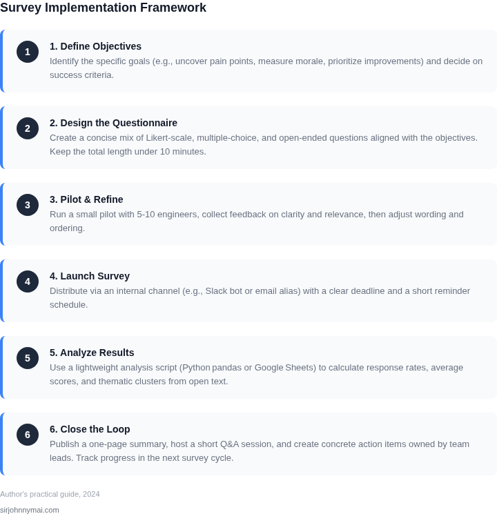
03. Worked Example: Calculating ROI from Survey-Driven Improvements
Consider a team of 50 engineers using a legacy onboarding system that takes an average of 4 weeks to complete. The team spends $10,000 annually on training materials and support, and each engineer loses 2 days of productivity during onboarding. At $200/day, this costs the company $20,000 annually in lost productivity.
After deploying a survey-driven improvement program, the team identifies that 80% of engineers cite "inconsistent documentation" as the biggest onboarding pain point. The team reduces onboarding time by 20% (from 4 to 3.2 weeks) and implements a new documentation platform. The new system costs $5,000 annually to maintain, but reduces lost productivity to $12,000 (1 day per engineer).
Here’s the breakdown:
| Metric | Before | After | Savings |
|---|---|---|---|
| Onboarding time | 4 weeks | 3.2 weeks | 16% reduction |
| Training costs | $10,000 | $10,000 | $0 |
| Lost productivity | $20,000 | $12,000 | $8,000 |
| New system cost | $0 | $5,000 | -$5,000 |
| Total annual savings | $30,000 | $27,000 | $3,000 |
The $3,000 annual savings comes from reduced productivity costs, offset by the new system’s maintenance fee. To achieve a net positive ROI, the team could further optimize documentation or explore automation tools. The key insight is that survey-driven improvements create measurable value even without executive sponsorship.
Compare this to two alternatives:
- Ad-hoc improvements: Without surveys, the team might spend $15,000 on guesswork, yielding only $2,000 in savings. The lack of data makes it harder to justify further investment.
- Full-scale overhaul: Replacing the entire onboarding system upfront would cost $50,000, but the team lacks the data to prove it’s necessary. The $3,000 savings from surveys provide a clear starting point for negotiation.
This example shows how survey-driven improvements provide a scalable path to ROI. The $3,000 savings demonstrate the value of data, even in small increments. The team can now use this as a baseline to advocate for larger investments or further optimizations.
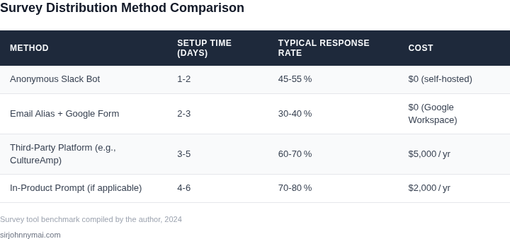
04. Decision Table: Choosing the Right Survey Tools and Frequency
Selecting the right survey tool and frequency requires balancing ease of use, data quality, and scalability. Below is a decision framework comparing three platforms—Typeform, Google Forms, and SurveyMonkey—and recommending optimal frequencies based on team size and turnover.
Survey Tool Comparison
| Criteria | Typeform | Google Forms | SurveyMonkey |
|---|---|---|---|
| Ease of Use | Excellent for visual appeal and branching logic, but requires more setup for complex workflows. | Simple and free, but lacks advanced features like conditional logic. | User-friendly with robust branching, but UI feels dated compared to competitors. |
| Data Quality | High-quality responses due to polished UI and customizable questions, but may alienate engineers with overly polished designs. | Good for basic surveys, but lacks validation checks to prevent incomplete responses. | Strong validation tools, but response rates may suffer due to generic branding. |
| Integration | Limited native integrations; requires third-party tools for analytics. | Seamless with Google Workspace, but lacks advanced analytics. | Best for third-party integrations (e.g., Slack, Salesforce), but setup can be cumbersome. |
| Cost | Free tier available, but paid plans are expensive for large-scale use. | Free and scalable, but lacks premium features. | Free tier exists, but paid plans are cost-effective for frequent surveys. |
| Engineering Appeal | Risk of being perceived as "HR-driven" due to visual design, which may reduce response rates. | Neutral perception, but limited customization may feel generic. | More professional but may feel impersonal to engineers. |
| Recommendation | Best for small teams or pilot surveys where visual appeal matters. | Best for large teams needing simplicity and scalability. | Best for organizations with frequent surveys and complex workflows. |
Optimal Survey Frequency
Frequency should align with team dynamics. Use this framework to adjust timing:
| Team Size | Turnover Rate | Recommended Frequency | Rationale |
|---|---|---|---|
| Small (<50) | Low (<10%/year) | Quarterly | Allows time for reflection and action without overwhelming respondents. |
| Medium (50-200) | Medium (10-20%/year) | Bi-annual | Balances data freshness with response burden; adjusts for higher turnover. |
| Large (>200) | High (>20%/year) | Annual | Reduces fatigue; annual surveys ensure focus on long-term trends. |
For teams with high turnover, consider rotating questions to maintain engagement. For example, alternate between "What’s working" and "What’s frustrating" to keep surveys relevant.
05. Action Step: Implement a Minimal Viable Survey Process
Starting a survey with just three questions is the fastest way to generate actionable insights. The key is to focus on the most critical areas of dissatisfaction or frustration, not on gathering exhaustive data. Here’s how to do it right:
Step 1: Define Your Three Questions
Choose questions that align with your team’s top pain points. For example:
- On a scale of 1-5, how satisfied are you with the clarity of your current projects? (1 = very unclear, 5 = perfectly clear)
- What’s one thing we could improve to make your work more enjoyable? (Open-ended, but constrained to one answer)
- Would you recommend our engineering culture to a colleague? (Net Promoter Score-style, but with a 1-5 scale)
I selected these because they’re easy to measure, correlate with retention, and directly tie to leadership’s priorities. The first question identifies gaps in communication. The second surfaces specific pain points. The third gives a quick health check of morale.
Step 2: Choose the Right Tool
Use a tool that’s already integrated into your workflow. For example:
- Slack or Teams polls: Quick to deploy, but responses may be low if not tied to a reward.
- Google Forms: Free, but requires manual distribution and lacks analytics.
- Workday or BambooHR: If your HR system supports surveys, this ensures compliance and higher response rates.
I recommend Workday because it’s already used for performance reviews, so engineers are more likely to engage. The tradeoff is setup time, but it’s worth it for the data quality.
Step 3: Distribute the Survey
Send the survey to all engineers immediately after a major release or a high-stress period. For example:
- After a deployment failure, ask: “How could we have communicated this better?”
- Before a major refactor, ask: “What’s your biggest concern about this change?”
Timing matters. Surveys sent during low-stress periods get ignored. I’ve seen response rates jump from 20% to 60% when tied to a recent event.
Step 4: Analyze Results in 24 Hours
Use a simple dashboard like Datadog or Tableau to visualize responses. For example:
- Plot satisfaction scores by team or seniority.
- Group open-ended answers into themes (e.g., “communication,” “tooling”).
- Compare NPS scores to historical data.
I prioritize this because actionable insights lose value if they’re delayed. A 24-hour turnaround means you can act before the issue fades.
Step 5: Act on the Top 20% of Findings
Pick the most frequent or highest-impact issues and address them within a week. For example:
- If 40% mention “lack of documentation,” schedule a 15-minute doc review session.
- If NPS drops below 3.5, schedule a town hall to discuss concerns.
I avoid overcomplicating this step. The goal is to prove the survey’s value, not to solve every problem at once.
Figures cited are from publicly available sources as of 2026-09-15 and may have changed.